
You're probably staring at three things right now. A platform export full of columns no stakeholder will ever read, a spreadsheet someone on the team started months ago and kept patching, and a slide deck that gets rebuilt from scratch every reporting cycle.
The worst part isn't the admin work. It's that the final report still doesn't answer the question leadership cares about: did the campaign move the business, and what should happen next?
That problem gets sharper for restaurants, retail, hospitality, and multi-location brands. Web clicks are only part of the story. People see a creator post, save it, visit two days later, book from a link in bio after work, or walk into a location and use a code at the till. If your campaign reporting template only captures immediate online conversions, you're under-reporting the campaign and making weak decisions off partial data.
A useful report is not a container for data. It's an operating tool. It tells the team what changed, why it changed, what deserves budget, and what needs fixing before the next campaign window closes.
Why Your Current Reporting Is Not Working
Most bad reporting starts the same way. Paid social lives in one dashboard. Google Analytics sits in another. Creator posts are tracked in a tab called “final_v6”. Promo codes are stored in someone's notes. Store managers send booking feedback on WhatsApp or email. Then someone tries to stitch it all together the night before the client review.
The result looks busy but says very little.
You get pages of impressions, clicks, reach, spend, engagement, comments, traffic, and screenshots. What you don't get is a clear answer to basic questions. Which audience converted? Which location responded? Which creator drove bookings rather than just views? Which campaign should be paused, extended, or repurposed?
Activity is not the same as reporting
A lot of teams mistake collection for clarity. They pull every available metric because they don't want to miss anything. In practice, that creates the opposite problem. Leadership scans the report, sees no narrative, and falls back on instinct.
Practical rule: If a metric doesn't support a decision, it doesn't belong on the main reporting page.
That matters even more in a market where digital media spend is so large. The UK spent £38.07 billion on advertising in 2024, with internet advertising at £29.6 billion, or 77.7% of total spend, according to the Advertising Association and WARC figures cited here. When internet advertising dominates at that scale, reporting can't stay informal. Teams need a repeatable way to track CTR, CPA, ROAS, conversions, and revenue against spend.
What broken reporting usually looks like
Too many exports: Teams report what platforms make easy to export, not what decision-makers need to see.
No common structure: One campaign report starts with spend, another starts with reach, another starts with screenshots.
No offline view: Bookings, footfall, review generation, and in-store redemptions get discussed verbally but never logged consistently.
No recommendation layer: The report ends with metrics instead of actions.
A good campaign reporting template fixes this by forcing consistency. Same structure. Same KPI logic. Same attribution rules. Same benchmark method. That's what turns reporting from a monthly chore into a management system.
Laying the Foundation with the Right KPIs and Data
The first job is to decide who the report is for. A regional marketing manager, a founder, a paid media lead, and a store operations director don't need the same view. Strong reports are built for a defined decision-maker and use a narrow KPI set tied to the campaign objective, then move from top-level summary to campaign breakdown to avoid metric overload, as outlined in this reporting guidance from Supermetrics.

Start with the objective, not the dashboard
If the campaign objective is awareness, your template should prioritise visibility and attention metrics. If the objective is bookings or sales, the report should lean hard into conversion and commercial outcomes. If it's an influencer programme, you may need both performance and content operations in the same view.
A clean way to build the first page is this:
Campaign summary: date range, market, audience, channels, objective.
Scorecard: a small KPI block with only the numbers tied to success.
Breakdown: campaign, audience, location, creator, or channel level detail.
Interpretation: what changed and why.
Recommendation: what to keep, cut, test, or scale.
Essential KPIs by campaign objective
Campaign Objective | Primary KPIs | Secondary KPIs |
|---|---|---|
Brand awareness | Impressions, reach, visibility metrics | Clicks, time on page, engagement indicators |
Performance marketing | Conversion rate, CPA, ROAS, revenue | CTR, landing page behaviour, budget pacing |
Influencer campaigns | Conversions, code redemptions, UTM outcomes | Content output, comments, review volume, asset reuse |
Footfall and bookings | Bookings, in-store code use, location-level outcomes | Clicks, landing visits, call activity, delayed conversions |
This is where junior marketers often go wrong. They treat “more data” as “better reporting”. It usually means a cluttered deck and no clear decision path.
Reports should answer one question per page. If a page tries to explain audience quality, creator output, paid efficiency, and location performance all at once, no one will know what to do with it.
Use a narrow KPI set that matches the buying journey
A hospitality campaign often needs one set of metrics for discovery and another for transaction. A retail launch may need separate views for online sales and store visits. That's normal. What doesn't work is blending all of it into one flat table.
For influencer programmes especially, it helps to define KPI tiers before launch. This guide on setting influencer marketing KPIs that drive growth is useful if you need a working model for output, engagement, conversion, and commercial impact.
A practical KPI hierarchy looks like this:
Primary business KPIs: bookings, purchases, revenue, qualified leads
Attribution KPIs: UTM sessions, code redemptions, assisted conversions
Delivery KPIs: content published, posts live, creator completion status
Diagnostic KPIs: CTR, landing page engagement, channel split, audience response
Keep the scorecard small. Put the rest in drill-down tabs or appendix slides. That's how a campaign reporting template stays readable.
Mapping Attribution to Measure True Impact
Attribution gets messy when the campaign doesn't end on a checkout page. That's why most generic templates fail in local retail, hospitality, and multi-location reporting. They capture impressions and clicks, then stop.
A stronger report includes delayed attribution, geo-split results, and code-redemption timing, especially when you need to connect creator activity to footfall, bookings, or review volume, as noted in this monthly marketing reporting guide.
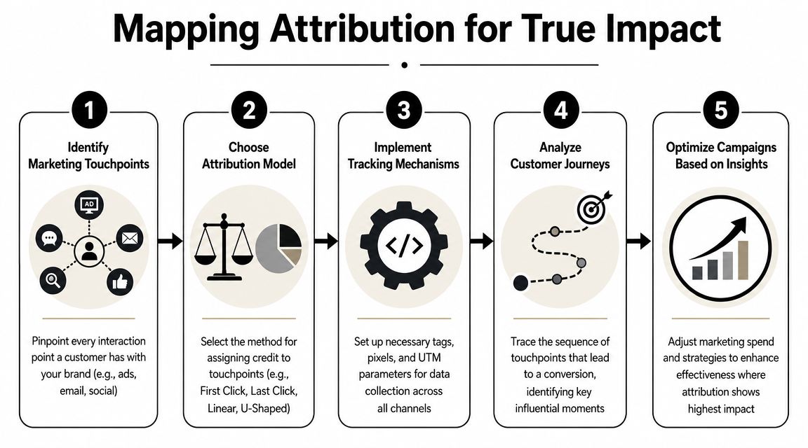
Build your attribution logic before the campaign goes live
Don't wait until reporting week to decide what counts as evidence.
Set up a basic attribution map with these fields:
Touchpoint source: creator, paid ad, email, organic social, referral
Tracking method: UTM, unique code, booking link, call tracking note, review prompt
Conversion type: sale, booking, store visit, enquiry, review
Delay window: same day, short lag, later conversion
Location layer: city, branch, postcode cluster, region
If your team hasn't formalised this before, it helps to review different approaches to selecting attribution models. You don't need a perfect model. You need a model the team understands and applies consistently.
What works for offline and delayed outcomes
For restaurants, venues, salons, clinics, and local stores, I'd structure the template to capture four types of evidence.
Unique promo codes: Best when the offer is redeemed in-store or at booking. Codes should map to creator, campaign, and if relevant, location.
UTM links: Best for measuring visits, landing page behaviour, and online bookings tied to a post, Story, bio link, or paid reuse.
Geo-split reporting: Useful when the campaign is local and nearby branches perform differently.
Lag tracking: Necessary when someone sees content today and converts later.
One of the most practical setups is to pair every creator with both a UTM link and a unique code. That gives you immediate web data and delayed redemption data in the same report. If you need a hands-on framework, this guide on tracking influencer marketing attribution with promo codes is a solid operational reference.
Fields your template should include
A campaign reporting template meant for offline impact should have columns or sections for:
Content date: when the post went live
Offer window: when the incentive could be redeemed
Redemption timing: whether use happened on the same day or later
Store or venue location: where the outcome occurred
Review outcome: whether the campaign also lifted user reviews or review prompts
Booking notes: especially useful if front-of-house teams ask “how did you hear about us?”
If the sale happens offline, the report has to meet the customer where they converted, not where the marketer wishes they converted.
That's the difference between reporting campaign activity and reporting campaign impact.
Designing Your Spreadsheet and Slide Deck Layouts
The spreadsheet and the slide deck do different jobs. The spreadsheet is the system of record. The slide deck is the decision document. Teams run into trouble when they try to make one asset do both.
What the spreadsheet should handle
A useful spreadsheet is operational first. It should be easy to update, audit, and reuse next month without rebuilding formulas.
A structure that works well:
Tab | Purpose |
|---|---|
Dashboard | High-level KPI view and key status indicators |
Raw imports | Platform exports kept untouched for auditability |
Campaign mapping | Naming conventions, objectives, audience, channels |
Creator tracking | Live dates, deliverables, links, codes, compliance notes |
Attribution | UTM data, code redemptions, bookings, offline outcomes |
Content library | Asset links, usage status, reuse notes |
Recommendations log | Actions taken and next test ideas |
Google Sheets is usually enough for smaller teams. Excel is still strong when you need heavier formula logic. Lookups, conditional formatting, filters, and summary tabs do most of the work. Keep formulas in dedicated columns and lock the cells people shouldn't touch.
What the slide deck should do
The deck is not for data storage. It's for interpretation.
Leadership doesn't need to see every row from your export. They need the answer to three things:
What happened
Why it happened
What should happen next
That changes the layout. Good decks usually open with a one-page summary, then move into a small set of trend or breakdown slides, then finish with recommendations. If your audience is commercial or operations-heavy, include one slide on location-level outcomes and one on attribution confidence.
The strongest reporting decks don't prove you worked hard. They prove you know what to do next.
What to include in each format
Use the spreadsheet when the audience needs to validate inputs, inspect details, or pull ad hoc cuts. Use the deck when the audience needs a decision in a meeting.
A practical split looks like this:
Spreadsheet for practitioners: platform data, formulas, UTM rows, code logs, audit trail
Deck for leadership: summary, benchmarks, exceptions, insights, recommendations
Appendix if needed: screenshots, creator examples, content notes, compliance records
If you're reporting to clients, make the deck visually clean and the spreadsheet accessible but separate. If you combine them, the main story gets buried under admin detail.
Analysing Results and Scaling Your Reporting Process
A report starts earning its keep when it provides context. Without that, even accurate numbers are weak. The best UK digital marketing reports compare results against the previous period, the same period last year, and the target. Reporting absolute numbers without a benchmark makes it hard to tell whether performance is improving or only fluctuating with the market, as outlined in this UK reporting guide from Funnel.

The benchmark layer most teams skip
If a campaign generated more clicks this month, that might be good. It might also be irrelevant. Maybe spend increased. Maybe seasonality lifted all demand. Maybe one location had a local event. Maybe a creator posted at a better time.
That's why I prefer a simple comparison rule:
Use previous period for tactical optimisation
Use same period last year when seasonality matters
Use target versus actual for budget and performance management
This is especially important in retail and hospitality. Demand shifts can distort a point-in-time result. A benchmark layer shows whether the campaign improved efficiency, not just volume.
Turn metrics into actions
The analysis section of a campaign reporting template should not read like a dashboard export. It should sound like a recommendation memo.
Instead of writing:
CTR was strong
bookings were lower
one creator had high engagement
Write:
traffic quality improved from one creator segment, but booking completion lagged at the landing page
one location converted better than the others, so local budget or creator mix should shift there
code redemptions appeared after the initial posting window, so same-day reporting understated impact
That's the level where reporting starts influencing spend, creative, and channel mix.
A lot of teams automate the collection layer but still leave the interpretation layer manual. For ideas on tightening that workflow without losing judgement, these PlotStudio AI report automation insights are worth reviewing.
Later in the reporting cycle, a walkthrough can help the team absorb the pattern and not just the spreadsheet.
Scaling without losing consistency
As campaign volume grows, inconsistency becomes a significant risk. One account manager labels creators one way, another uses different location names, someone else forgets the benchmark tab, and your roll-up becomes unreliable.
Three things keep the process stable:
Standard naming conventions: campaign, location, creator, channel, offer
A fixed page order: summary, benchmark, breakdown, recommendations
A recurring review rhythm: active campaigns are usually reviewed more frequently, while broader reporting rolls up on a regular cadence
If you're running multiple clients or locations, build one master template and clone it. Don't let every team invent its own version. This guide on how agencies can scale influencer campaigns without hiring is useful if you're trying to grow campaign volume while keeping execution disciplined.
Beyond the Numbers and Your Downloadable Template
The best campaign reporting template does more than measure media performance. It also records whether the campaign was run properly.
That matters more now in creator programmes. Many templates still stop at impressions, clicks, and conversions. They don't track whether posts were clearly disclosed, whether rights to reuse assets were documented, or whether content can be safely repurposed later. Stronger influencer reporting should include compliance, asset governance, and content durability, including disclosure compliance rates and the percentage of UGC reused in paid media, as discussed in this marketing reporting template analysis.
What to add before you call the template finished
Add a final section or tab for governance. It doesn't need to be complex. It just needs to exist.
Include fields such as:
Disclosure status: whether each creator post was properly marked as advertising
Usage rights status: whether the brand can reuse the asset in paid social, email, or on-site
Rights expiry notes: when that usage window ends
Content reuse status: whether the strongest assets were repurposed
Review and reputation notes: whether the campaign influenced review generation alongside direct conversions
A campaign can look efficient on paper and still create avoidable risk if the reporting ignores disclosure and asset rights.
If you want a starter format, build one spreadsheet with six tabs: summary, raw data, attribution, offline outcomes, content governance, and recommendations. That's enough structure to make the report useful without making it so heavy that nobody updates it.
The point isn't to make reporting more complicated. It's to make it more complete.
If you want a faster way to launch creator campaigns and report on clicks, conversions, bookings, revenue, promo code use, and reusable UGC in one place, Sup is built for exactly that workflow. It's especially useful for restaurants, ecommerce brands, agencies, and multi-location teams that need measurable creator ROI without managing the entire process by hand.

Matt Greenwell
Share